
Posterize Image Online Free
Reduce color levels to create bold poster-style effects, grayscale posterization, and pop-art visuals. Adjust levels from 2 to 32 with instant preview — no signup required.
Posterize workspace
Live, private processing in your browser
Drop a photo to posterize
Use a PNG, JPG, or WebP image. You can also paste directly from your clipboard.
What is Posterization?
Posterization is a color-reduction technique that maps the continuous tones of a photograph into a limited number of discrete levels. In a standard 8-bit image each color channel can hold 256 shades; posterizing to 6 levels, for instance, collapses those 256 shades into just 6 flat steps. The result is broad, uniform color bands that eliminate subtle gradients — the signature look of silk-screen prints and pop-art posters.
Compare posterize levels
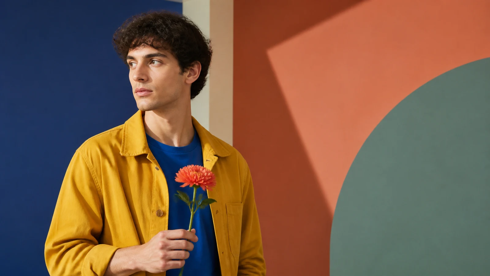
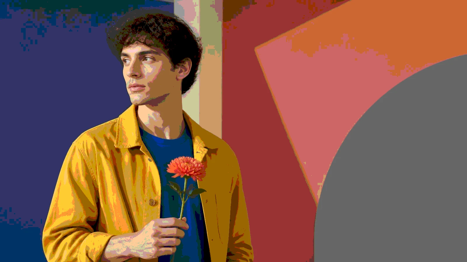
Clear tonal bands while keeping useful facial and fabric detail.
Free Posterize Filter for Photos and Pictures
Use the online posterize filter above to turn a photo or picture into a posterized image without installing editing software. Upload a JPG, PNG, or WebP file, choose how many color levels to keep, compare the original with the posterize effect side by side, and download the finished PNG, JPG, or WebP. Lower settings create dramatic blocks of color, while higher settings preserve more detail in faces, illustrations, and landscape photos.
- Bold at 3 levels for high-impact graphic art
- Balanced at 6 levels for detail and clear color bands
- Subtle at 12 levels for gentler tonal reduction
- Color or grayscale output processed privately in your browser
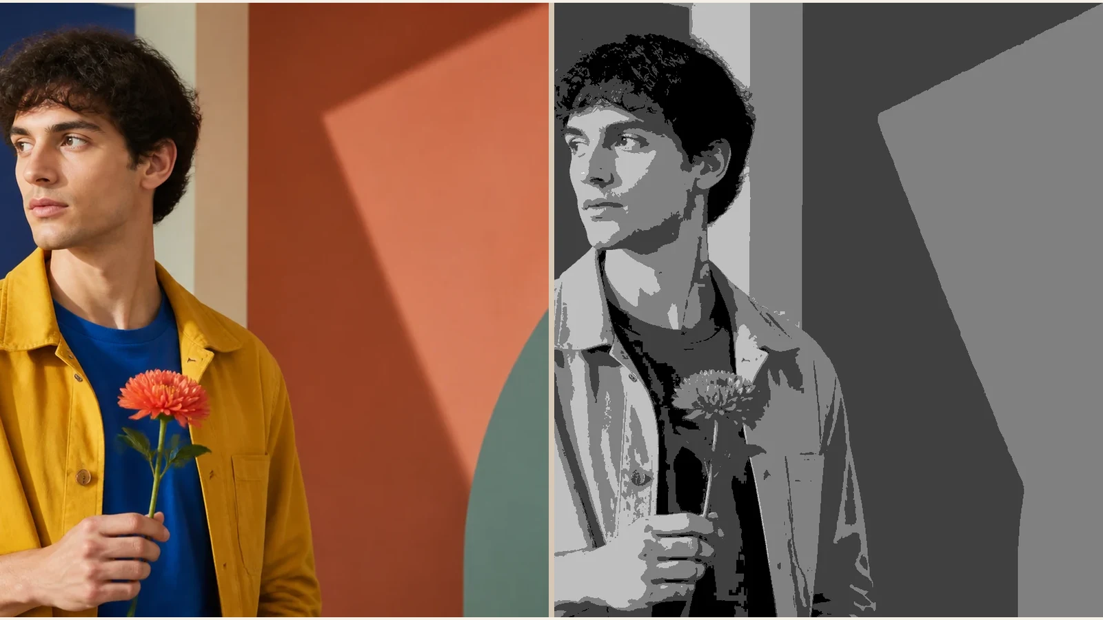
The technique has its roots in darkroom photography, where overexposing or underdeveloping a print could reduce tonal range and produce stark, graphic results. Andy Warhol famously exploited this effect in his silk-screen portraits, posterizing photographs before printing them in bold flat inks. Today the same idea lives on digitally: reducing color levels per channel yields the same flat-band aesthetic without chemicals or screens.
Posterization sits on a spectrum of color-reduction operations. At one end is grayscale image, which removes chrominance but keeps all 256 luminance levels. Posterization then reduces those levels further. Push it all the way to 2 levels and you arrive at pure black-and-white thresholding. Related techniques like dithering and halftone also reduce tonal complexity, but they simulate missing shades through spatial patterns of dots or noise, whereas posterization keeps pixels in place and simply snaps each value to the nearest allowed level.
Our posterize tool runs entirely in your browser — no server upload, no signup. Choose a preset or open Custom to adjust from 2 levels (maximum drama) to 32 (barely noticeable), and the preview updates in real time. Try posterizing a grayscale image for a classic Warhol look, then layer texture with add noise to image . Or keep full color for vibrant poster-style graphics.
For a step-by-step workflow with level recommendations and example use cases, read our guide to posterizing an image.
Posterization guide
Control how much tonal detail becomes flat graphic shape
Posterization turns smooth gradients into fewer levels. The art is choosing enough levels to keep the subject readable while making the simplification visible.
Recommended Settings
2-4 levels: bold poster art
Best for pop-art looks, silhouettes, and high-impact thumbnails.
5-8 levels: balanced stylization
Keeps faces and objects recognizable while still showing clear bands.
12-20 levels: subtle cleanup
Useful when you want a reduced-color look without destroying gradients.
Output Notes
- PNG output preserves hard color bands cleanly.
- Posterization can be combined with grayscale, duotone, or halftone.
- Screen-print planning may still require manual color separation.
Common Mistakes
Using too few levels on faces
At 2 levels, portraits often lose eyes, nose shape, and hair detail.
Expecting smooth gradients
Visible banding is the point of posterization, not a defect.
Skipping source cleanup
Noisy images can produce messy color bands. Try light blur or noise reduction first if needed.
Which Tool Should You Use?
| Tool | Best for | Note |
|---|---|---|
| Posterize | Flat bands and pop art | Reduces tonal levels per channel. |
| Monochrome | Two-color thresholding | More extreme than posterization. |
| Duotone | Two-color palette mapping | Keeps smooth mapping instead of bands. |
Frequently Asked Questions About Posterization
Learn about posterization and how it relates to grayscale, black & white, and other color-reduction techniques.
What is posterization in photography?
Posterization is a technique originating from darkroom photography that reduces the number of distinct tonal levels in an image. Instead of smooth gradients with 256 shades per channel, posterization snaps each pixel to the nearest of a smaller set of values — producing flat, graphic color bands reminiscent of silk-screen prints and pop-art posters.
How do I posterize a grayscale image for a Warhol effect?
First convert your photo to grayscale using our grayscale converter, then open it in this posterize tool and set levels to 3–5. The result is a high-contrast, flat-toned image similar to Andy Warhol's silk-screen portraits. You can also apply a duotone or color tint afterward for the classic multi-color Warhol look.
How many posterize levels should I use?
For bold, graphic poster effects use 2–4 levels. For a balanced stylized look try 5–8 levels. For subtle posterization that slightly simplifies gradients use 12–20 levels. At 2 levels the result is essentially black-and-white thresholding; at 32 the effect is barely visible.
Related Image Tools
Continue with closely related browser-based image tools.
Create Bold Posterized Images
Reduce color levels for poster-style art, pop-art effects, and graphic design. Free, instant, and completely private.